OC Magazine Icon!
Just drew an icon for this magazine in GIMP because i own it i guess and it was lacking it, what do you all think about it? I think it turned out pretty well!
Just drew an icon for this magazine in GIMP because i own it i guess and it was lacking it, what do you all think about it? I think it turned out pretty well!
Some more info and the reasoning behind design decisions....

Hi everyone, I’m back with another kbin icon pack. This time it’s flags for 18 EU countries (the non-fancy ones) + an EU flag. So 38 icons in total. All icons come in two styles: semi-transparent/glassy and opaque metallic. I also made a simple instance logo generator....

3D modeling...

Jewelry Design...

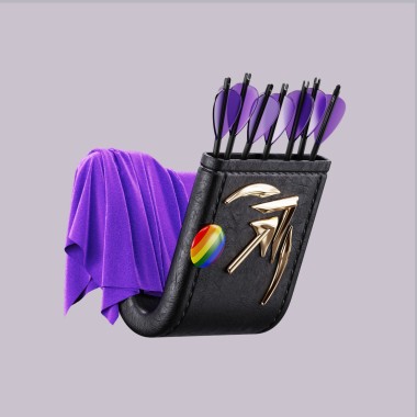
Artemis App...
Urban Details...

If you're the owner of a kbin magazine and would like to have an icon in this style, comment here for a request....
Honestly, I’ve been really enjoying making these, probably the most I’ve been excited to model something for months. So I exchanged some sleep for a faster turnaround :) Previous post here...

The icon is designed as a hypothetically producible piece of jewelry, except that the corners — those tiny semi-spheres that hold the gems — are a bit larger to accommodate the icon's scale. The piece has a partially open back to allow for more light to reach the gems. That makes them look prettier both in renders and irl....
So I 3D modelled two icons (well, illustrations rather) for the communities that I created on kbin: Industrial Design and Jewelry Design. These icons are meant to reimagine kbin’s logo in a way that's relevant to each community....

Edit: Vote on the poll for a name!...

I really loved @FixedFun 's idea for the kbin mascot, so I decided to refine it a bit and make some color alternatives. All credit to them for this wonderful idea! I merely refined it. Note, the circles beside the logo are just a color pallete swatch, not actually meant to be apart of the logo....
